


GOLDFINGER ARCHITECTES - IDENTITÉ VISUELLE
License to kill (the game)
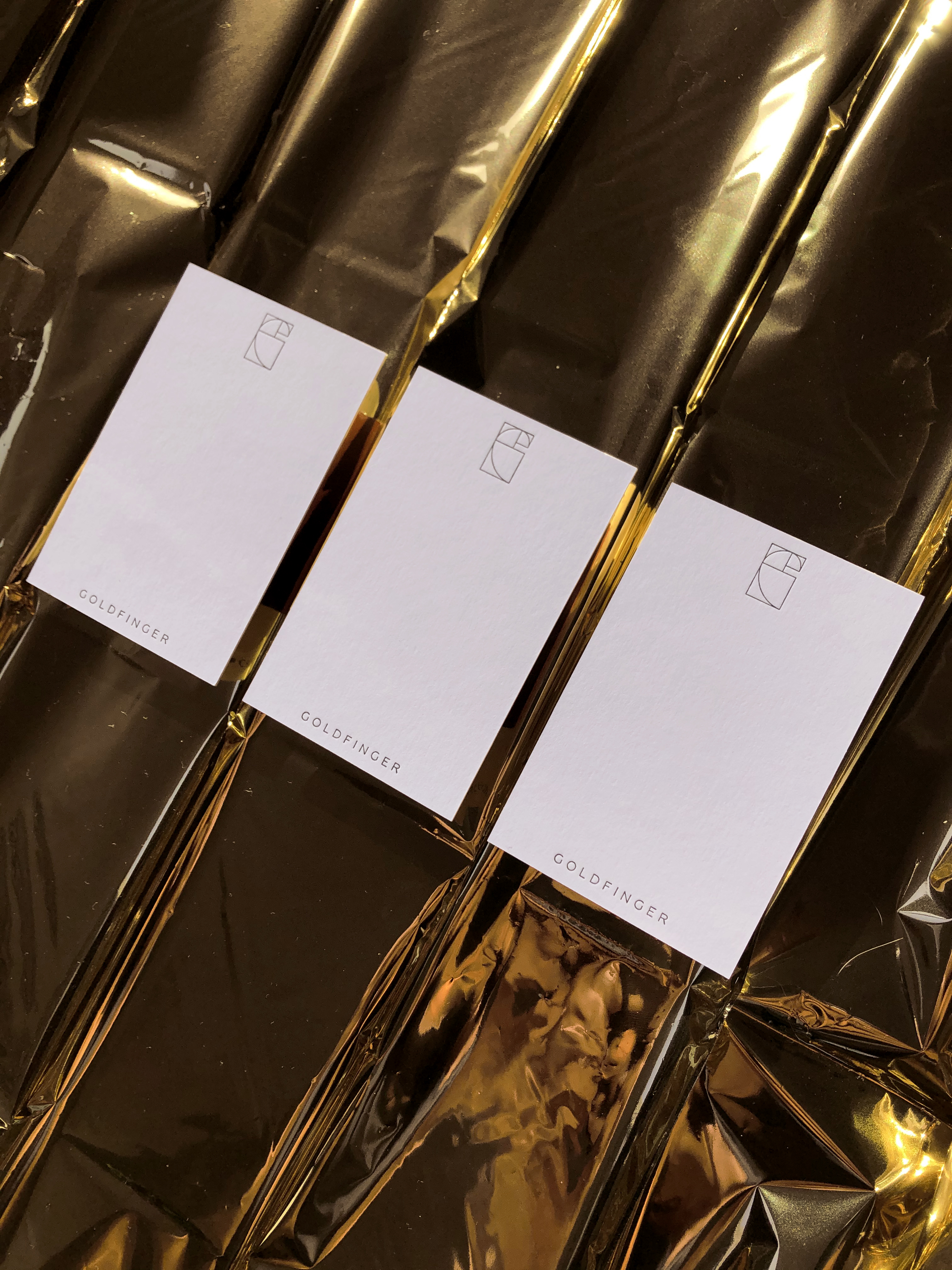
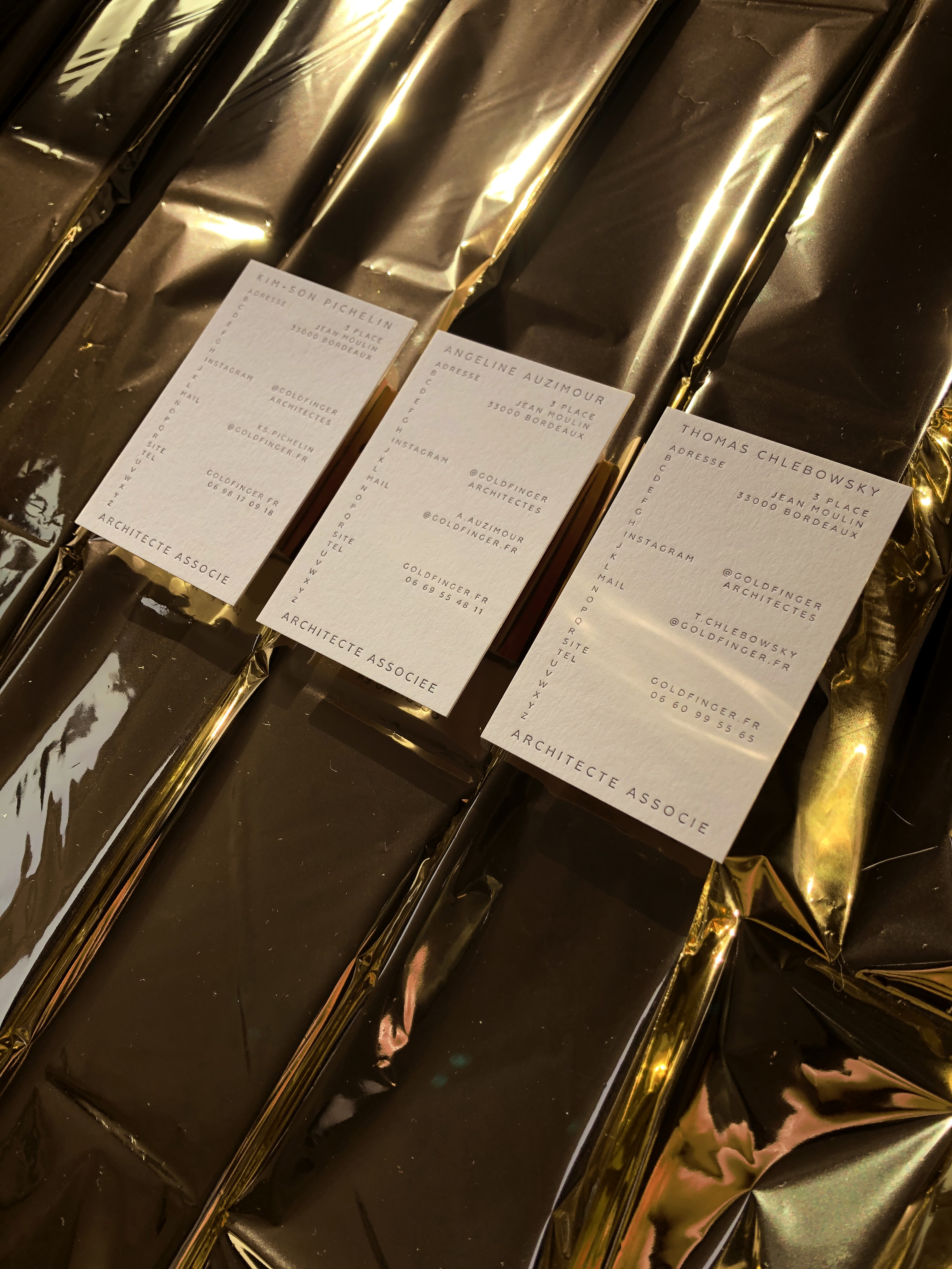
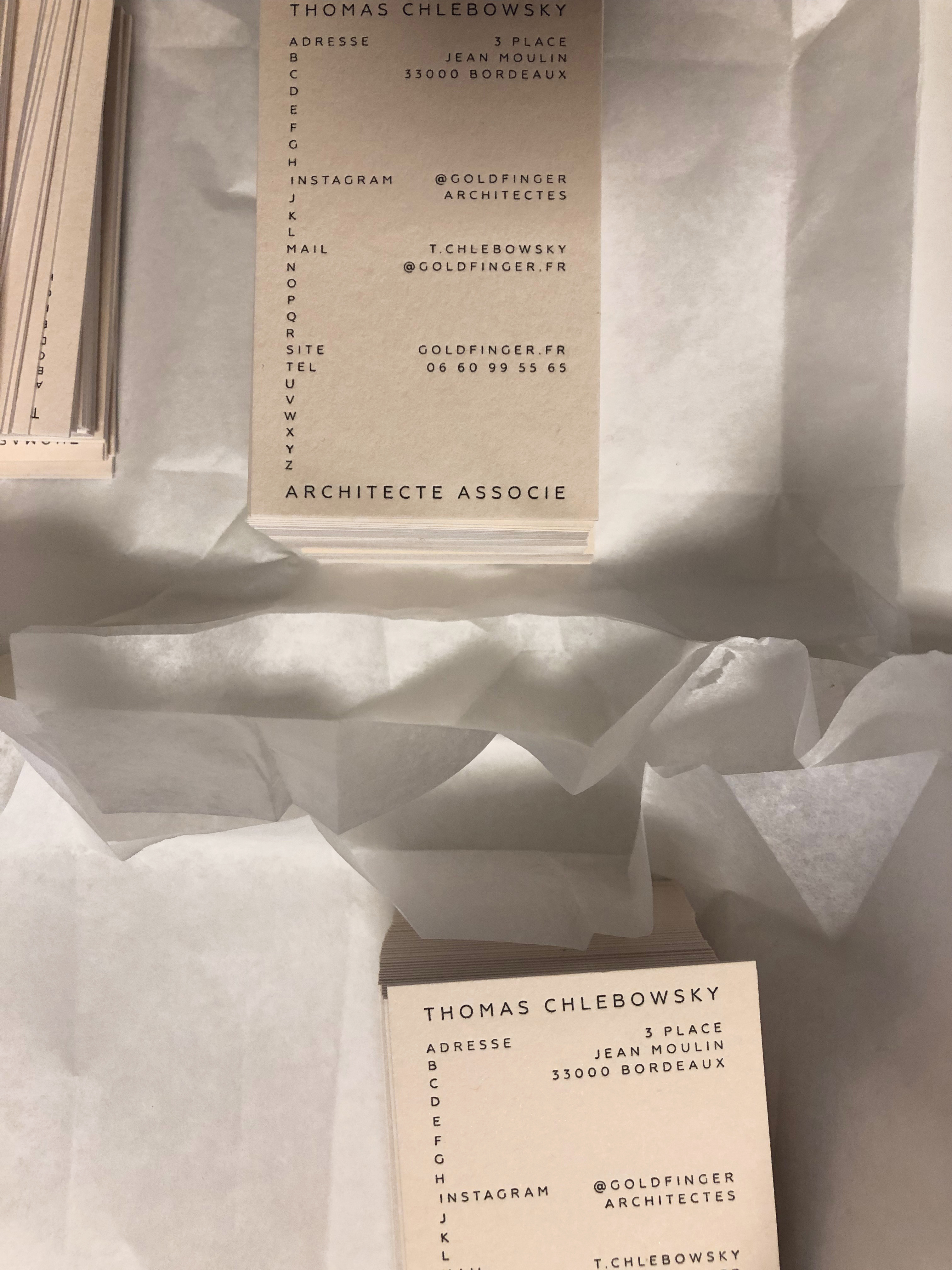
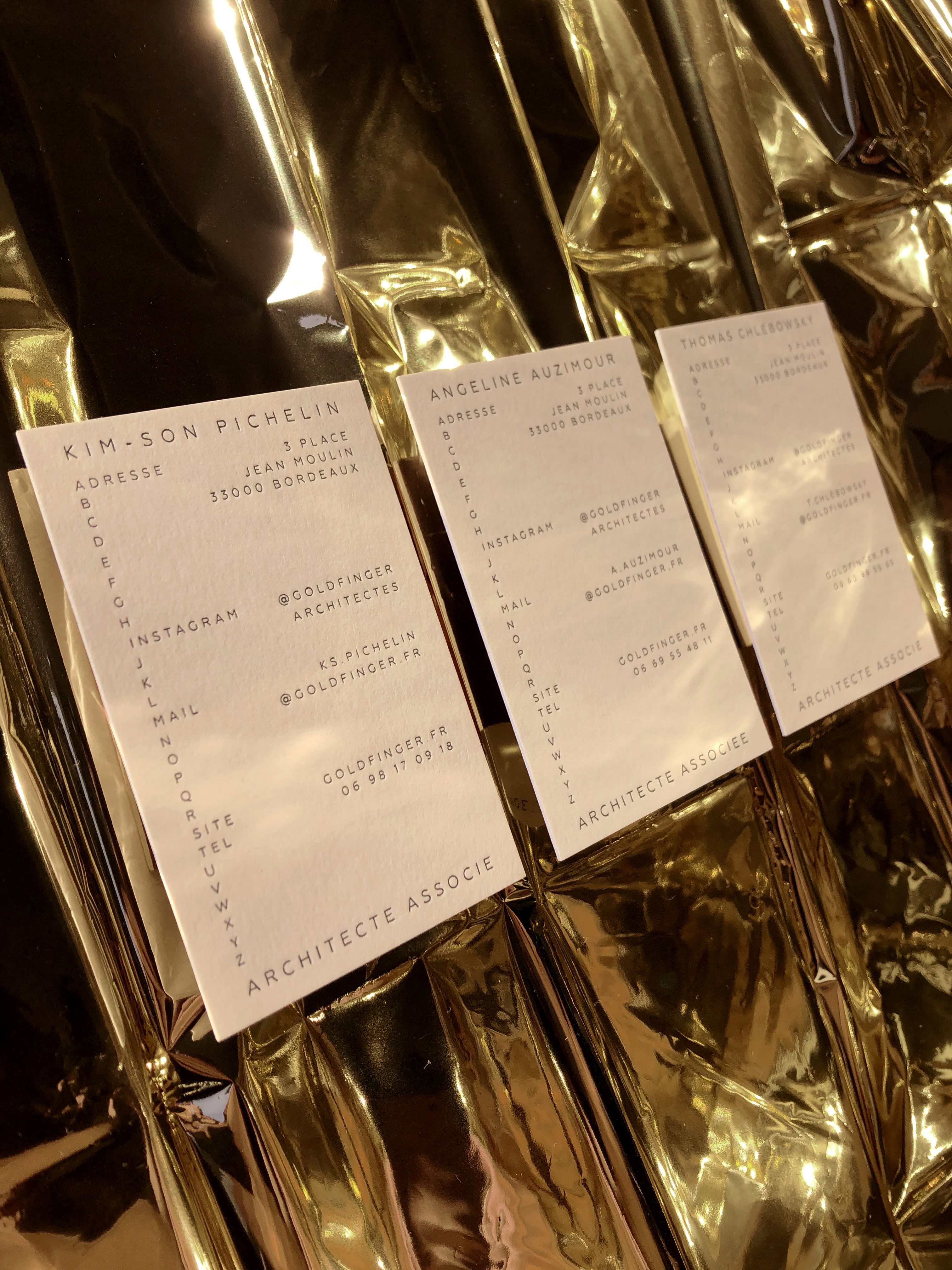
Le Studio a accompagné une année durant le trio d'architectes Laabo pour concevoir sa nouvelle communication et lui trouver un nouveau nom. C'est désormais sous le patronyme de Goldfinger que répondent les trois comparses. Nouvelle identité visuelle donc, déclinaison de papeterie, stratégie digitale, le studio a développé une communication et un logotype axés sur le nombre d'or cher au Bauhaus, clin d'oeil aux 100 ans de l'école d'architecture et d'art appliqués. Développée avec l'aide précieuse de Léa-Elisabeth Amrouche, directrice artistique parisienne, l'identité visuelle s'exprime en toute sobriété, se refusant les écueils trop tape-à-l'oeil et le bling-bling que suggère le nom Goldfinger. Les cartes de visite sont soigneusement imprimées par l'atelier à dorer bordelais Ex Anima, contrecollées et foulées sur papier Colorplan 350g. Merci à Kim-Son Pichelin, Angeline Auzimour et Thomas Chlebowsky pour leur enthousiasme et leur accompagnement. Retrouvez-les sur @goldfingerarchitectes
The Studio accompanied a year during the trio of architects Laabo to design their new communication and find it a new name. It is now under the surname of Goldfinger that the three stooges respond. New visual identity, declination of stationery, digital strategy, the studio has developed a communication and a logotype focused on the golden ratio dear to the Bauhaus, nod to the 100 years of the school of architecture and arts. Developed with the precious help of Léa-Elisabeth Amrouche, Parisian art director, the visual identity is expressed in all sobriety, refusing the pitfalls too flashy and the bling-bling suggested by the name Goldfinger. The business cards are carefully printed by the Bordeaux printer Ex Anima, laminated and stride on Colorplan 350g paper. Thanks to Kim-Son Pichelin, Angeline Auzimour and Thomas Chlebowsky for their enthusiasm and their support. Follow them on @goldfingerarchitectes