


RETRAVAIL DE L’IDENTITÉ VISUELLE DE BARTHÉLÉMY RÉNOVATION
On rafraîchit !
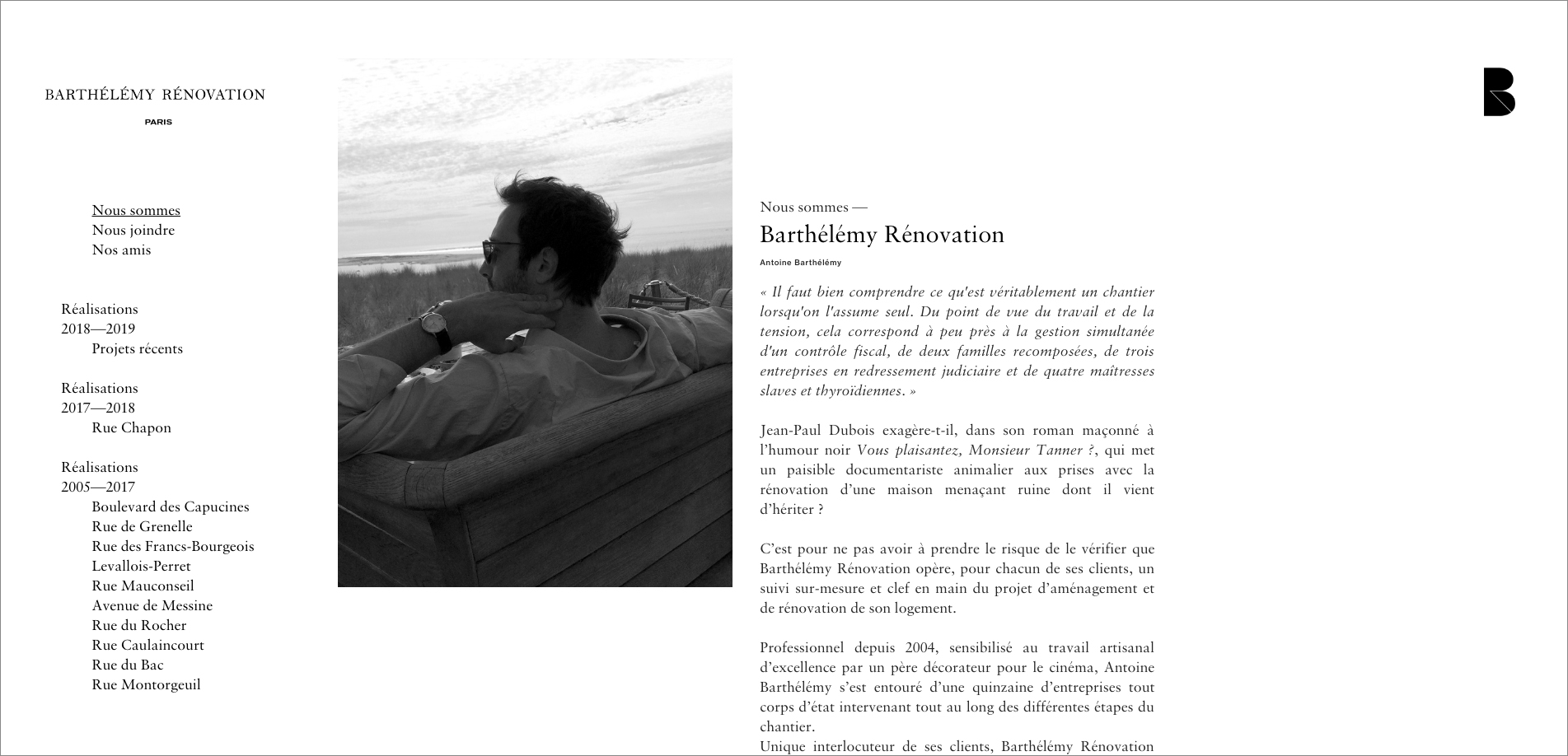
Il y a une dizaine d’années, nous étions heureux d’accompagner Antoine Barthélémy dans la création de son identité visuelle. Depuis, beaucoup de travail à été réalisé par Antoine et ses équipes, qui est spécialisé dans la rénovation d’appartements haut de gamme. De notre côté, et bien, rien n’a vraiment changé. Le logotype est resté tel qu’il était. Ah oui, il a juste perdu ses empattements ... qui sont réapparus dans une nouvelle typographie adjointe au logo.
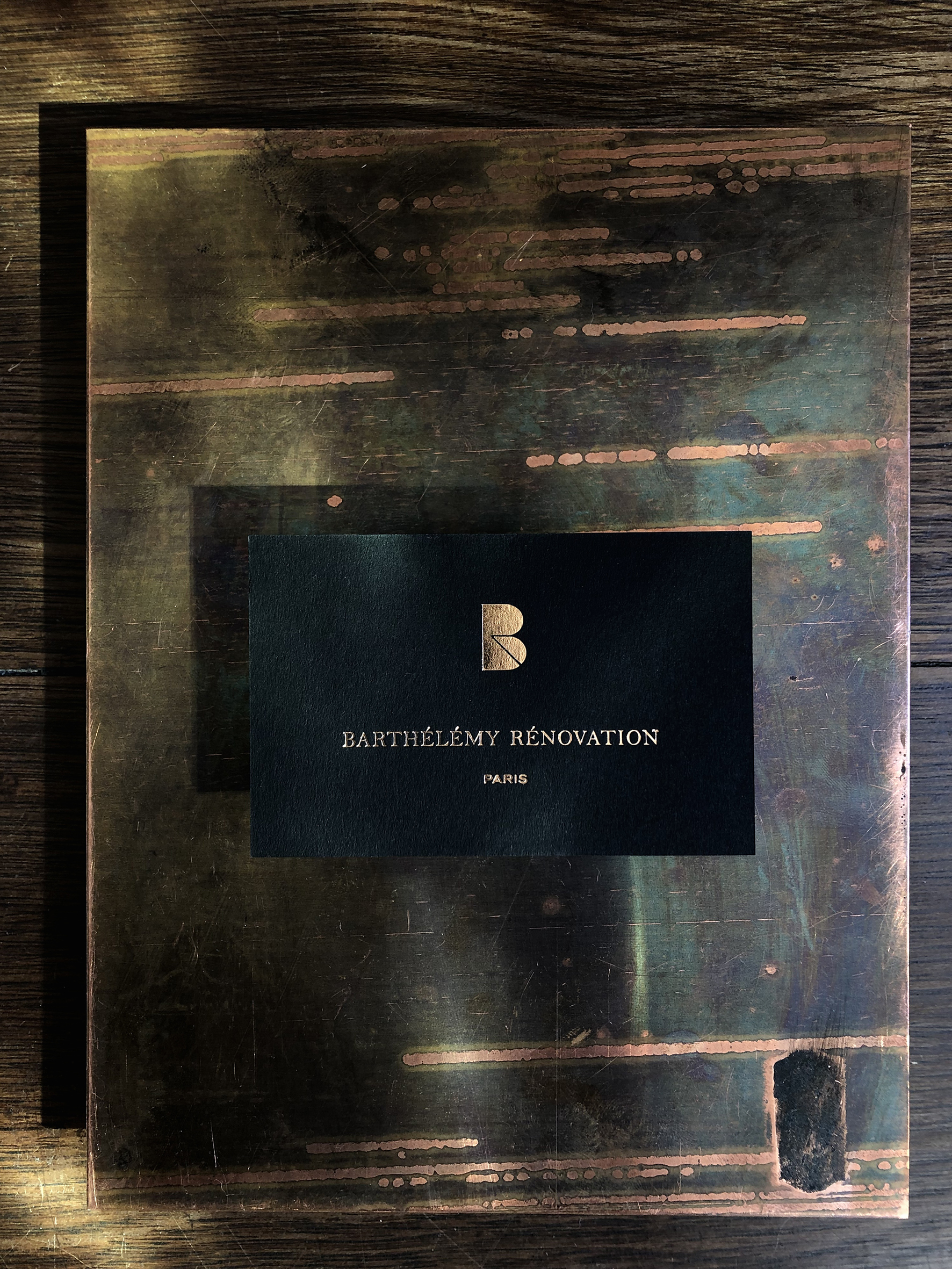
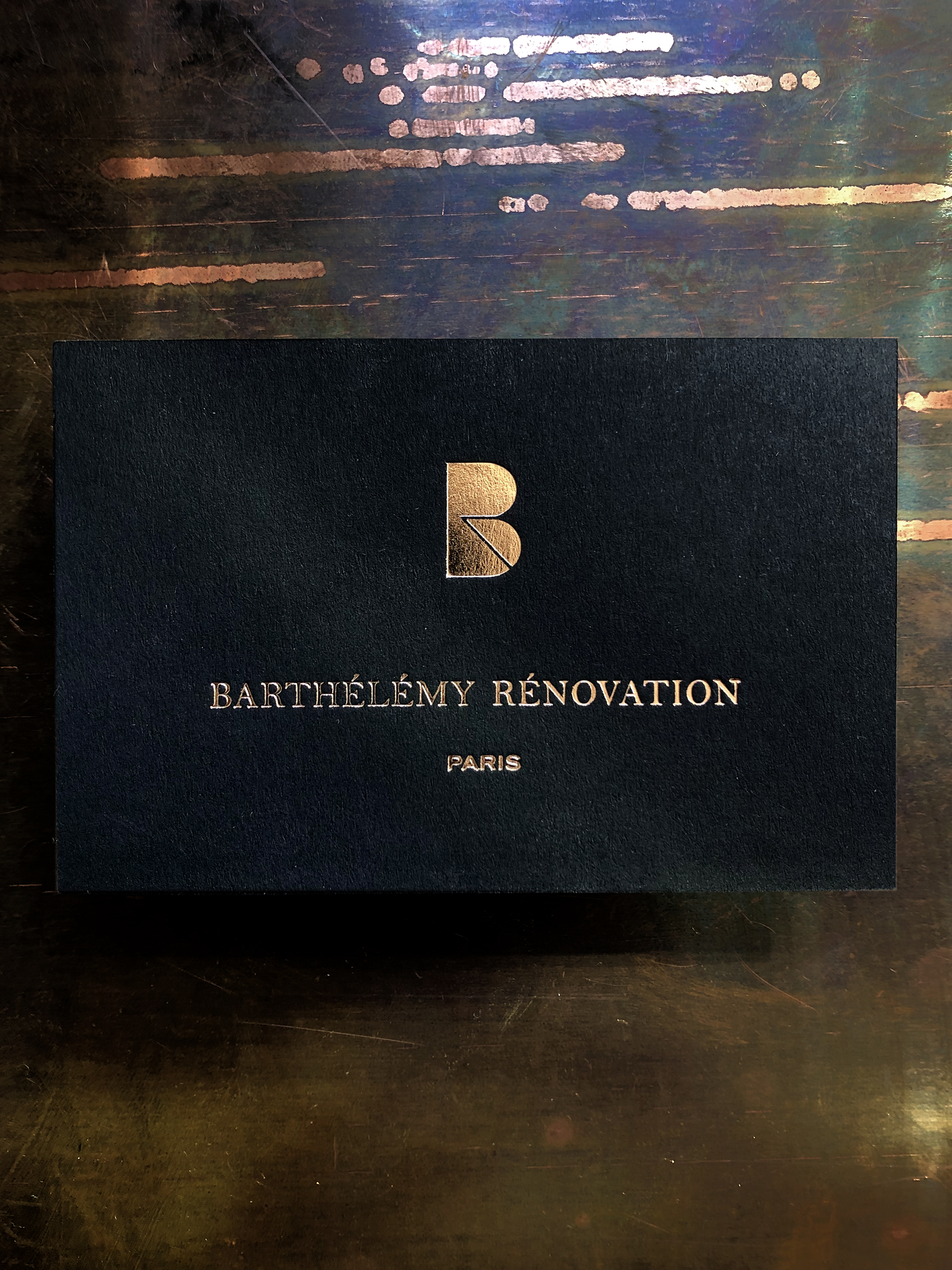
Même les cartes de visite sont restées noires. Certes, le blanc a laissé place à un beau cuivré, savamment imprimé par l’atelier à dorer Ex-anima.
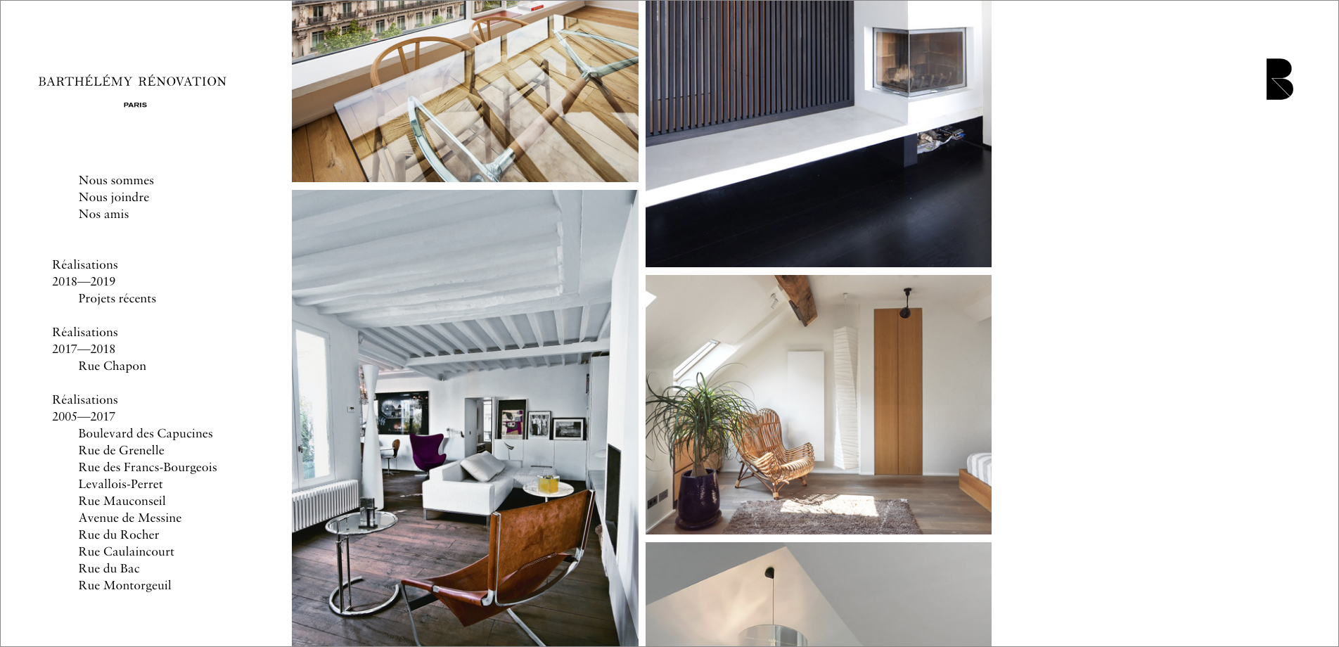
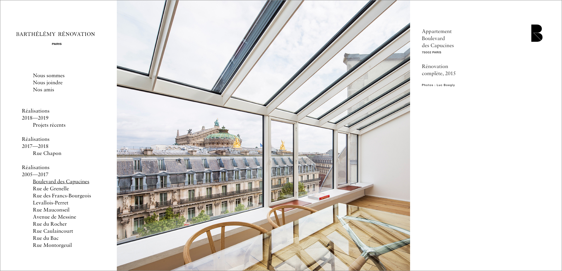
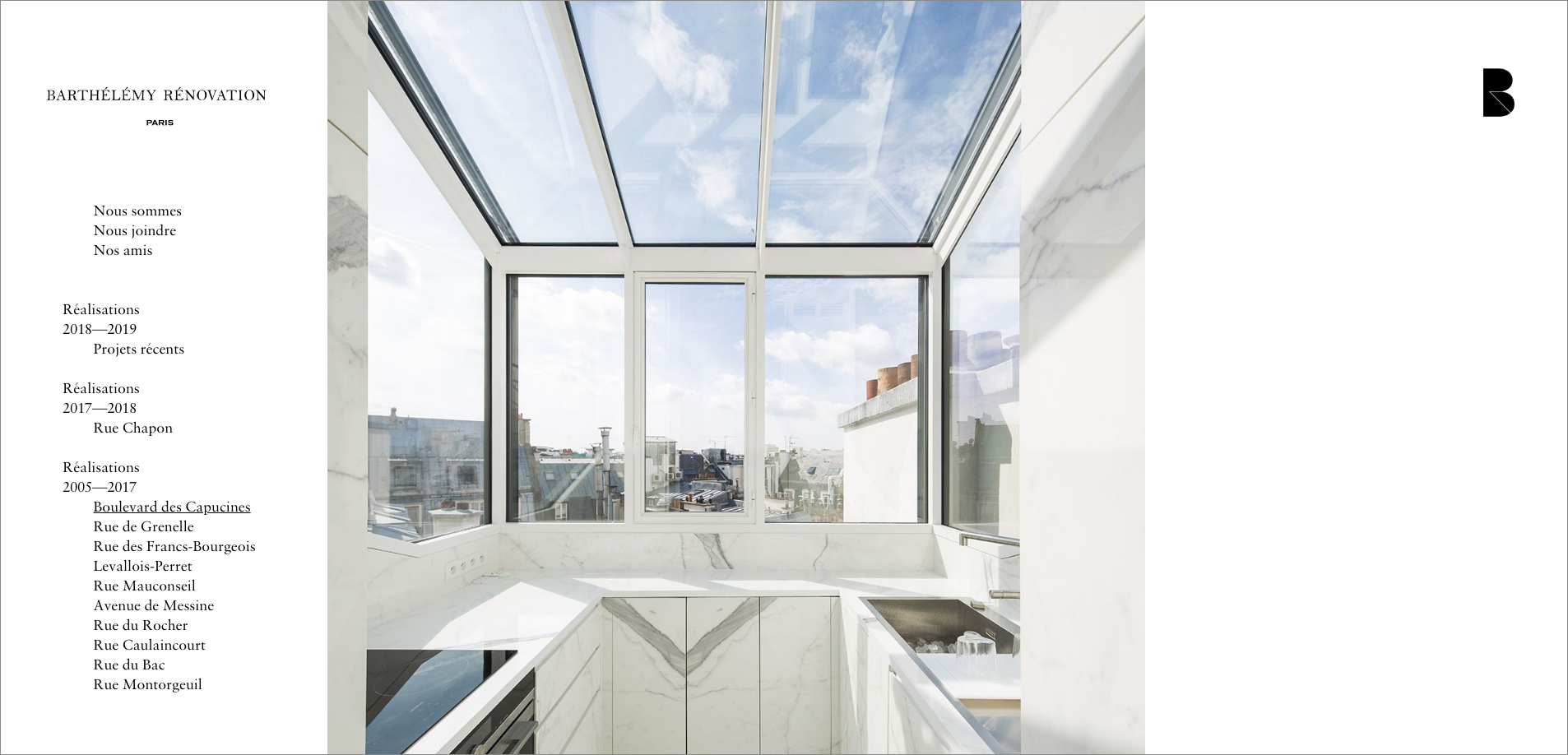
Le site a gagné en clarté, tout en jeu de formes et de contre-formes. Antoine vous le dira, c’est au détail que l’on reconnait une belle signature. Le marbre noir se marrie à merveille avec un interrupteur cuivre bien pâtiné. C’est entendu Maestro.
www.barthelemy-renovation.com
A decade ago, we were happy to go with Antoine Barthélémy in the creation of his visual identity. Since then, a lot of work has been done by Antoine and his teams, which specializes in the renovation of upscale apartments. On our side, well, nothing has really changed. The logotype remained as it was. Oh yes, he just lost his serifs ... which reappeared in a new typography added to the logo.
Even the business cards remained black. Certainly, the white has given way to a beautiful copper, cleverly printed by the printing atelier Ex-anima.
The site has gained clarity, while playing forms and counter-forms. Antoine will tell you, it is in the detail that we recognize a beautiful signature. Black marble marries wonderfully with a copper switch well patted. It's understood Maestro.
www.barthelemy-renovation.com